


Redesigning a Book Cover
How I taught myself graphic design with a self-motivated project

Previously published in Writer’s Blokke on Medium in 2020.
A few months back I wanted to challenge my illustration and design skills by redesigning a cover of one of my favorite books, Coraline. This personal project sparked my enthusiasm, as I’ve always been fascinated by book covers. By putting certain images and blending them with specific typography in a limited area, a designer can immediately indicate to readers what the book’s genre and content are about.
Going into this, I already knew I wanted the front cover to be illustrated. I’ve always been drawn to illustrated covers rather than those with stock footage, as an illustration lends the cover a somewhat unique, human touch. It’s always interesting to see what kind of art style a designer chooses and how it fits with the story as a whole.
I first looked at other book covers, to get a feel for how they are usually designed and structured:


Afterwards, I created a few digital thumbnails in Krita, a free and open-source alternative to Photoshop.
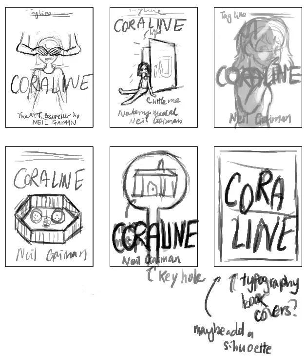
I started by focusing on and drawing certain ‘motifs’ and images that were repeated throughout the story. These included: the eponymous character Coraline, the black cat, buttons, sewing needle and thread, the Pink Palace, the doll, and hands. I even tried making a typographic cover, similar to most collector’s editions.
Eventually, I chose the top-right design, as I wanted the main attention to be on Coraline herself. I also wanted to allude to the book’s hidden mystery, which is portrayed with the use of deep shadows across her face.


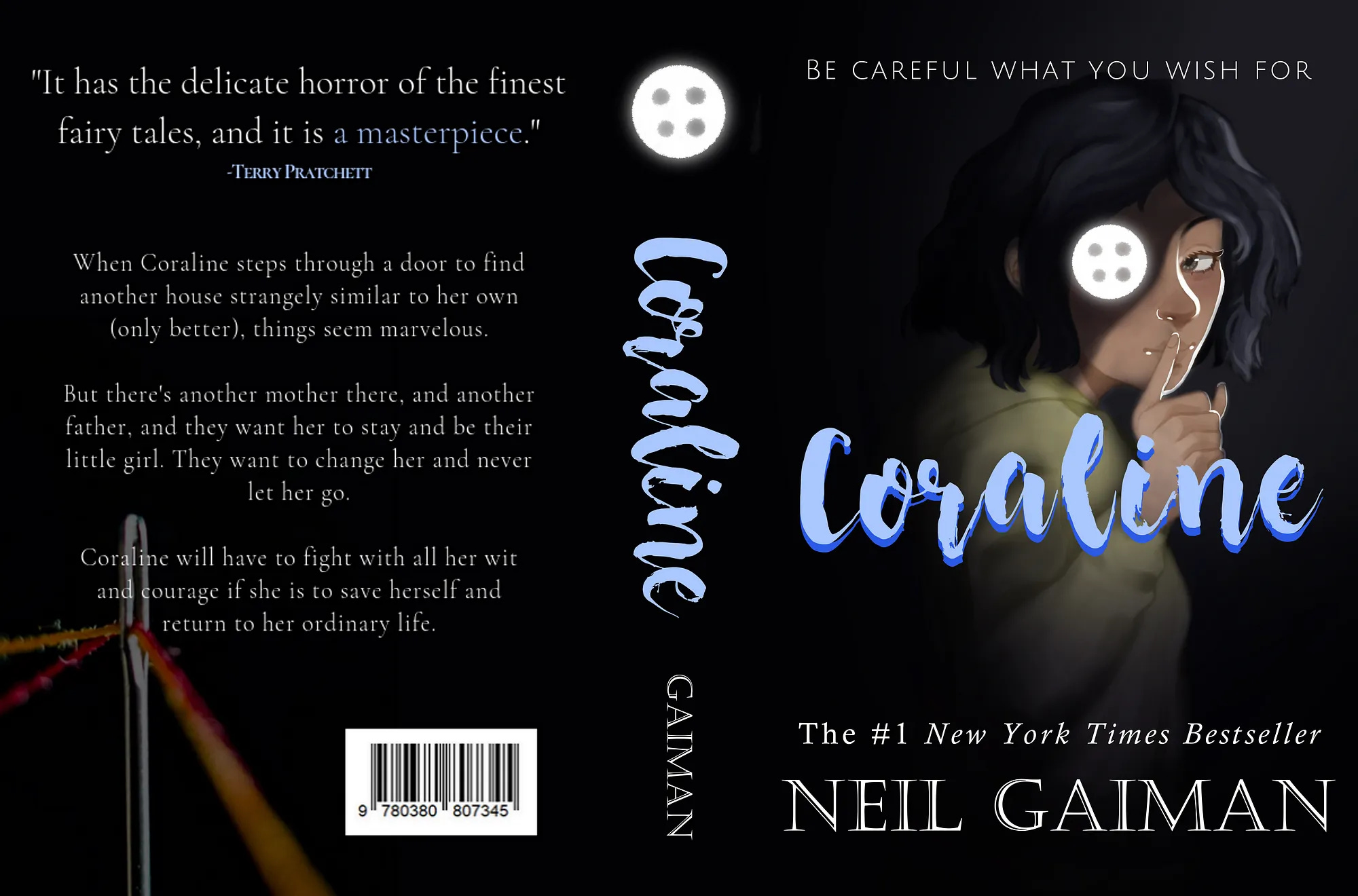
I quickly sketched the final character design for the book cover. I decided to follow Coraline’s movie design, as the film is pretty well known and the character design is very distinctive. I initially coloured it in greyscale, to get a better sense of the values and shading. Afterwards, I used an overlay layer mode to add the colours and deeper shadows.
Next, I added a glowing button over Coraline’s right eye. As buttons are a repeated symbol in the book, I decided to make it stand out on the cover. I also hoped to hint at the book’s plot; what the antagonist wants, and what Coraline stands to lose.
For the title, I selected the script font, Nightingale. It had a whimsical and childish quality, which I thought felt appropriate as Coraline is marketed as a children’s novella/middle-grade novel.
I used light blue for the title to contrast with Coraline’s yellow rain jacket, and dark blue for the shadows, to create a sense of suspense. On the top, I included the movie’s tagline to highlight the dark fantasy aspect of the plot. I also wanted to pay homage to the movie.
I increased the font size for the author’s name, as Neil Gaiman is someone very famous in the literary field. So I wanted to draw attention to it.
Overall, my book cover design took a lot of inspiration from Adrienne Young’s Sky In The Deep. I loved the cover’s use of deep shadows to portray a sense of secrecy and eeriness, which is what I wanted to replicate in my work.
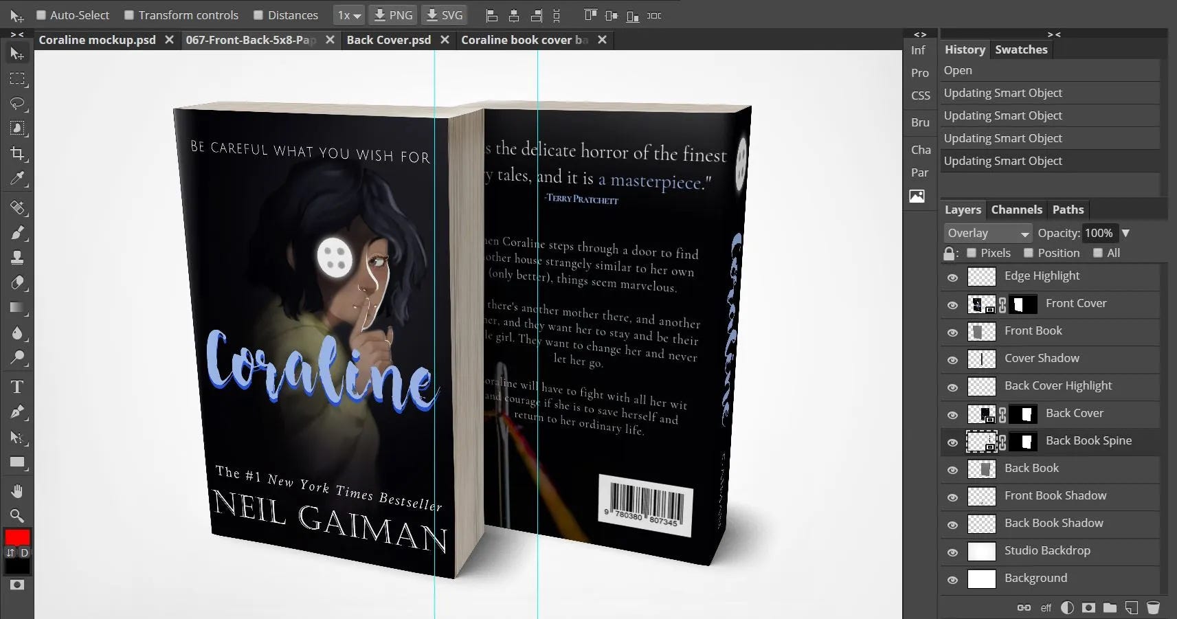
To make my project more lifelike, I downloaded a free digital mockup template. As Krita does not support smart objects, I used a free online alternative to Photoshop called Photopea. Afterwards, I transferred my digital files to the smart object to create my final mockup.
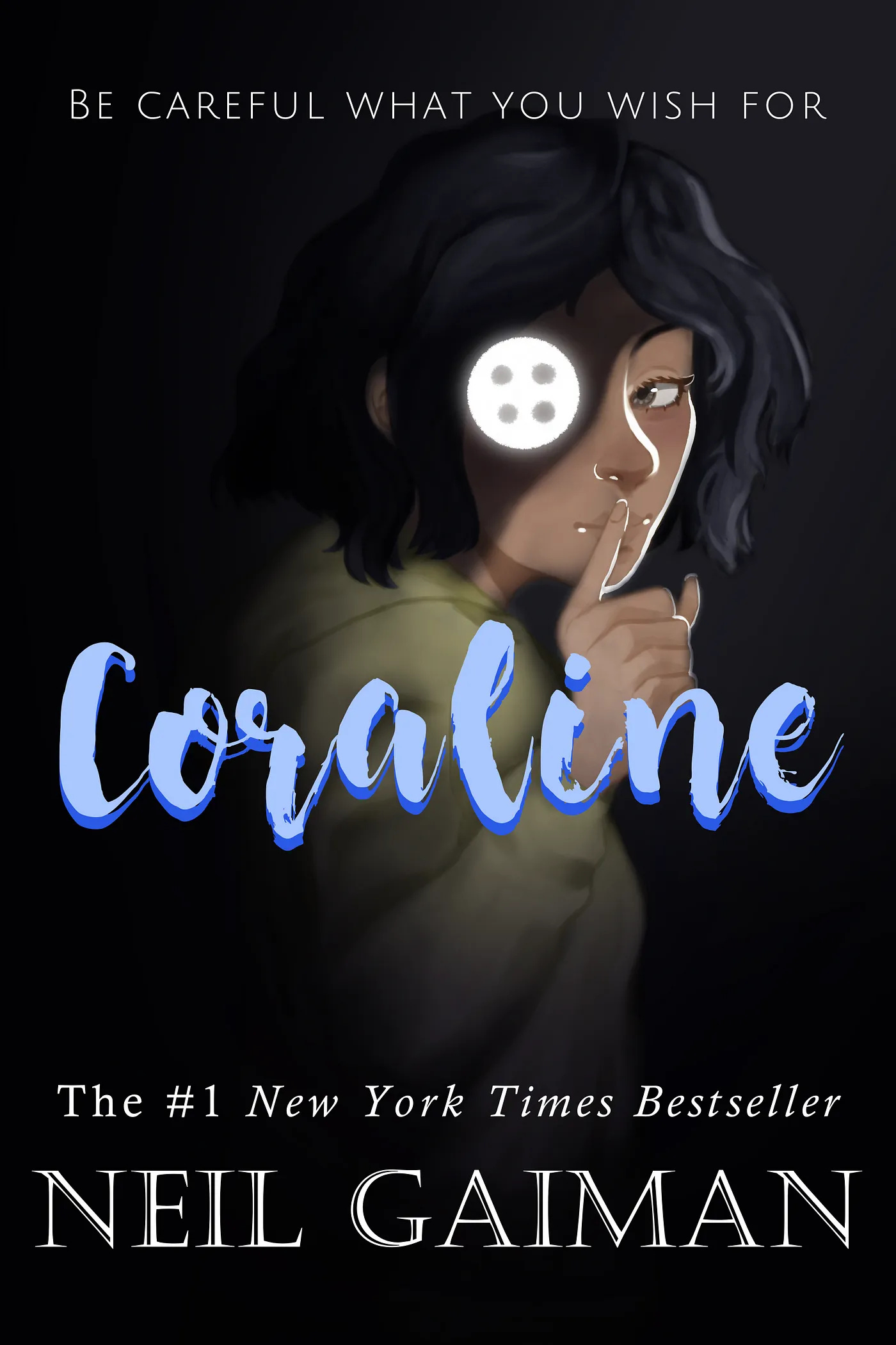
Here is my final product, as seen below.

What did I learn throughout this project?
Designing is hard
It may be a no-brainer, but designing book covers is extremely challenging! Honestly speaking, I never thought about how much effort it took for a designer to create the spine, front and back cover.
Aside from the illustration itself, I also had to learn about composition, how to combine different fonts, and how to structure the importance of information on the cover. I did this by varying font size, spacing, and typeface.
Another thing I had to keep in mind was keeping the design consistent with the spine and back cover — I certainly didn’t want there to be any confusing clashes!
Be Patient
Sometimes, you can’t rush creativity.
You need to experiment and try out different layouts, compositions, typefaces or colour schemes.
This tended to take up most of my time designing and sometimes I would get impatient. I admit I did end up rushing the spine and back cover, as I was frustrated with the slow pace I was going. I do somewhat regret making a rushed job of it. On the other hand, sometimes it is better to complete a project instead of taking forever to get it 100% perfect.
Book Marketing Trends
After analysing so many book covers, you tend to see a pattern in their designs. Mainly, blurbs (endorsements by other authors on the book) and awards will most likely be on the front cover. Personally, I never really used to notice them before as a reader — I was more focused on the back cover copy. But now, being the designer, I can see why these testimonials are added.
After all, book covers are a form of marketing, and anyone who says “I don’t judge a book by its cover” is most likely lying to your face.
Overall, despite the challenges, frustrations and occasional setbacks, I’m glad to have completed this project. It taught me a lot about illustration, graphic design, and surprisingly enough, marketing.
Someday, I’ll be looking to redesign more book covers. With every practice I take, my art and design skills improve. This makes me eager to take up more difficult yet rewarding personal projects.
Come check my Instagram and Twitter for more updates! And if you want to support me and all my endeavours, consider donating to my Ko-fi as well!